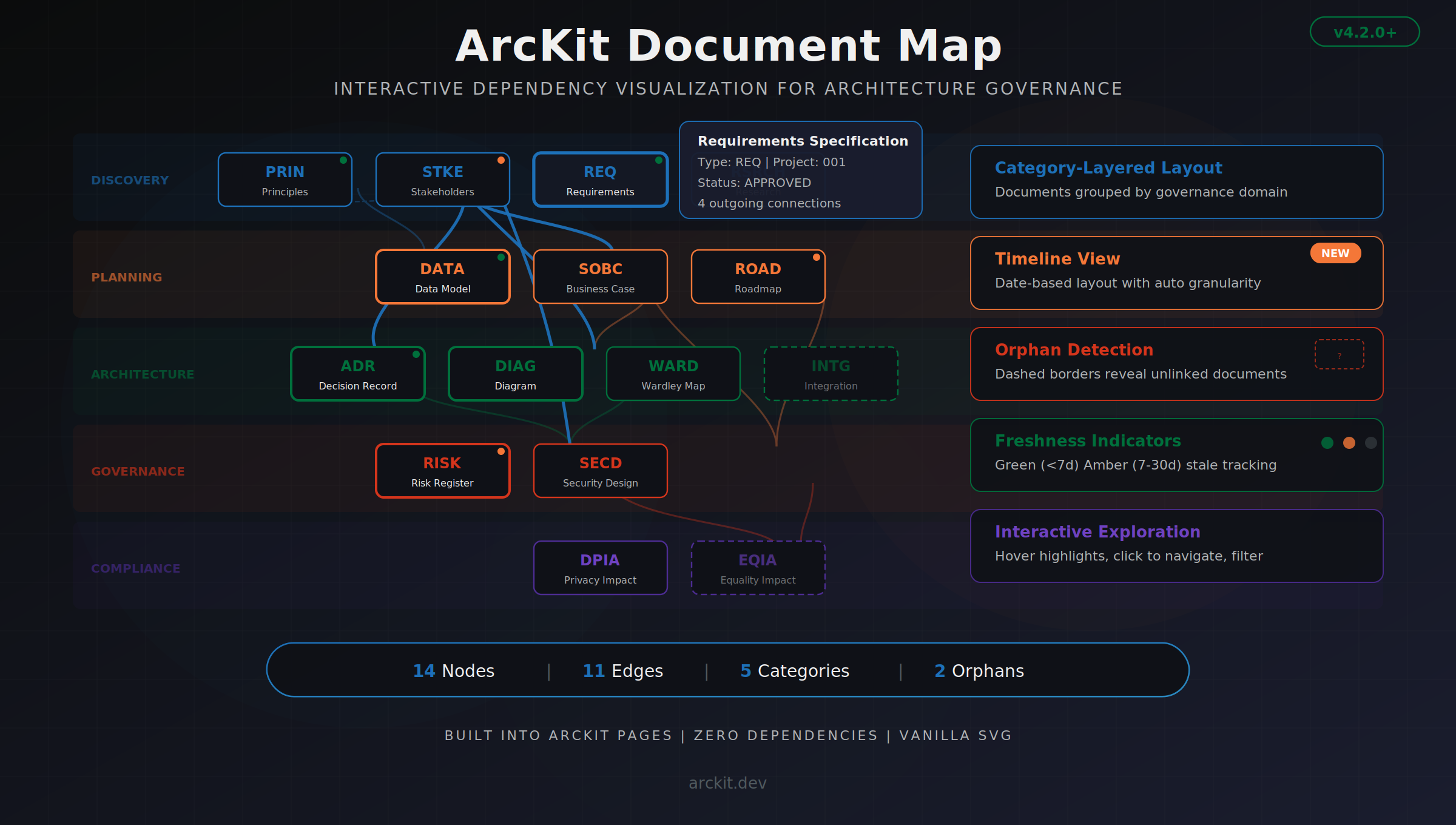
Introducing the Document Map: an interactive visualization for architecture governance artifacts
Every enterprise architecture programme generates documents. Requirements specifications, data models, architecture decision records, risk registers, stakeholder analyses, integration specifications — the list grows fast.
What grows faster is the web of relationships between them. Your requirements reference your data model. Your ADRs reference your requirements. Your integration specs reference your architecture diagrams. Your risk register should reference all of them.
Most teams track these relationships in spreadsheets, or worse, in their heads. When someone asks "what would be affected if we changed the data model?" the answer involves opening six documents and scanning for cross-references manually.
We built the Document Map to make those relationships visible.
What it looks like
[SCREENSHOT PLACEHOLDER — Full Document Map view showing nodes grouped by category bands, with colored edges connecting related documents across categories]
The Document Map is an interactive SVG dashboard built into ArcKit Pages. Every architecture artifact in your project becomes a node. Every cross-reference between documents becomes an edge.
Nodes are grouped into category bands — Discovery, Planning, Architecture, Governance, Compliance, Operations, Procurement, Integrations, and Reporting — giving you a layered view of your documentation landscape.
Colors are meaningful. Each category gets its own colour from the GDS palette, and edges inherit the colour of their source document. Hover over any node and its connections highlight while everything else dims. Click a node to open the document.
Seeing what's missing
One of the most useful things the map reveals is what isn't connected.
Documents with no edges — no references to or from other artifacts — get a dashed border. We call these orphans. An orphaned risk register means nobody linked risks back to requirements. An orphaned stakeholder analysis means it was written but never referenced by the decisions it should have informed.
Dashed borders make governance gaps impossible to ignore.
Timeline view
The default layout groups documents by category. But we added a second mode: timeline.
Toggle to the timeline view and documents reposition along a date axis based on when they were created. The system auto-detects the right granularity for your project — weekly buckets for projects under 90 days, monthly for projects up to 18 months, quarterly for longer programmes.
This view answers a different question: "How did our documentation evolve?" You can see whether requirements were written before architecture decisions (good) or after (concerning). You can spot phases where no documentation was produced. You can see the documentation velocity of your programme at a glance.
Freshness at a glance
Each node carries a small indicator dot in its top-right corner.
A green dot means the document was modified within the last 7 days. Amber means 7 to 30 days ago. No dot means it hasn't been touched in over a month.
During governance reviews, this is immediately useful. You can scan the entire map and identify which documents have gone stale without opening a single file.
Project filtering
Large programmes often have multiple workstreams — separate numbered projects within the same repository. The Document Map includes a project filter dropdown that narrows the view to a single workstream.
Global documents (like architecture principles in the 000-global project) always remain visible regardless of the filter, because they apply everywhere.
The stats bar updates in real time: "12 nodes, 8 edges" becomes "5 nodes, 3 edges" when you filter down.
How it works
The dependency graph is built automatically when you run /arckit:pages. A Node.js module scans all project directories, extracts document metadata from the Document Control section of each file, and identifies cross-references using pattern matching on ArcKit document IDs.
The result is written to manifest.json as a graph of nodes and edges. The dashboard reads this data and renders it as inline SVG — no external charting libraries, no framework dependencies, no build step.
Everything runs client-side in the browser. The entire visualization is self-contained in a single HTML file.
See it in action
You can explore a live example from one of ArcKit's test projects here:
https://tractorjuice.github.io/arckit-test-project-v17-fuel-prices/
Navigate to the Document Map tab to see the interactive visualization with real architecture artifacts.
Getting started
The Document Map ships with ArcKit v4.2.0 and later. If you're already using ArcKit, run /arckit:pages to generate your dashboard — the map is included automatically.
If you're new to ArcKit, it's an open-source architecture governance toolkit that provides 60 slash commands for AI coding assistants. The Document Map is one piece of a larger system designed to bring structure and traceability to enterprise architecture.
GitHub: https://github.com/tractorjuice/arc-kit
The Document Map was built to answer a simple question: "What connects to what?" Turns out, when you can see the answer, you start asking much better questions about your architecture.
Related Articles
- Document Map — LinkedIn Post
- ArcKit v4: First-Class Codex and Gemini Support
- The Toolkit Drafts. The Architect Judges.
- ArcKit v4.13.0: The Build Harness — A Full Architecture in One Session
Join the ArcKit Community
- Discord — real-time conversation, help with commands, and what people are building: discord.gg/HsA4Y3hQ4
- LinkedIn Group — announcements, case studies, and longer-form discussion: linkedin.com/groups/17641034
- GitHub — code, issues, and contributions: github.com/tractorjuice/arc-kit